This module's assignment called to apply the design and statistical analysis apparatus learned throughout the class via plot.ly, Tableau or Rstudio.
There is also a peer review aspect of this project:
- Clear, detailed and thorough libraries
- Lie factor
- Chart junk in the work
- Best graphical practices can be found in this work?
Previous projects:
Data:
"The dataset should contain at least 50 observations and 5 to 20 variables."
The dataset I have chosen is from my place of employment, the registration records for the USF Office of Corporate Training and Professional Education.
It contains 21 variables for 1,654 observations. It was important for me to use data I could directly apply in the workforce and this visualization will accomplish that in a relevant way.
Problem Description:
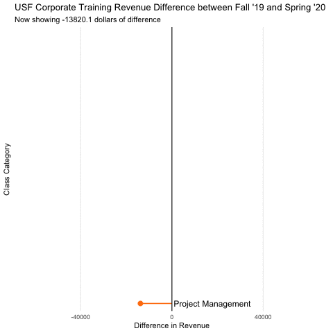
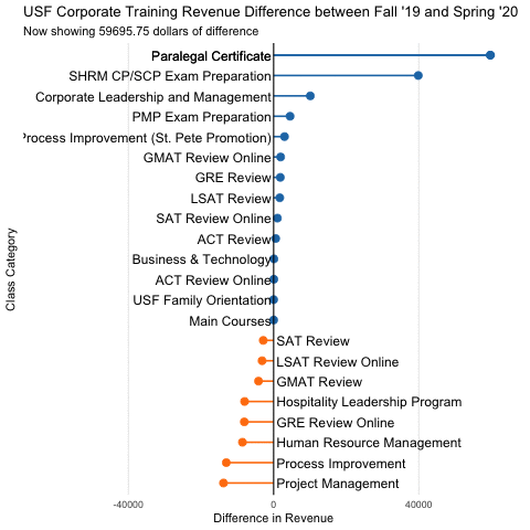
Registrations for non-credit professional development programs, like any other product, is cyclical when it comes to purchasing patterns. This quickly becomes complicated when you consider the context of the services provided. For instance, students are unlikely to invest in training at the end of the calendar year because it is assumed that our office follows the semester schedules of the main USF campus. Additionally, management must consider broader trends with consumers such as the overall economy, competing providers, and of course the recent pandemic. This visualization aims to solve the problem of "How can we quickly compare different financial quarters in terms of enrollment?". The visualization's logical sequence of data cleaning and plotting allow it to be outfitted for larger data sets covering wider spans of time.
Related Work:
This visualization implements the following methods discussed during class:
- Color
- Visual Differences
- Time Series
- Animation
Solution:
This problem was solved by first loading the data and separating the time intervals (Fall 2019) and (Spring 2020). Then, summaries must be created for each separate dataset to evaluate the total dollar amount of registrations grouped by program type. Once the summaries are created and combined, they can be visualized to highlight differnces in quantity and time via color, positioning, visual differences, and animation.
Plot
  ############################################################################
  # ----- ------ ------ ---- LIS 4317: Final Project ---- ------ ------ -----
  ############################################################################
  #' ---
  #' title:   "LIS 4317: Final Project"
  #' author:  "Kevin Hitt"
  #' date:    "Due: April 28th, 2020"
  #' ---

  # Load packages
  library(ggplot2)
  library(ggthemes)
  library(ggcharts)
  library(lubridate)
  library(gganimate)

  # ------------------------------------------------------------------------
  # LOAD AND CLEAN DATA
  # ------------------------------------------------------------------------

  # read data
  ctpe <- read.csv("revenue.csv", header = T)

  # assign column names
  names(ctpe) <- c("courseid",
                   "catid",
                   "catname",
                   "catcreated",
                   "currency",
                   "discount",
                   "enr_completion",
                   "status",
                   "orderid",
                   "tnid",
                   "credits",
                   "listingid",
                   "title",
                   "orderid2",
                   "price",
                   "paid",
                   "promo",
                   "purchasedat",
                   "email",
                   "userid",
                   "name")

  # examine data
  head(ctpe)
  str(ctpe)

  # remove invalid rows from beta environment
  ctpe <- ctpe[-c(1:19),]

  # change column from factor to date format
  ctpe$catcreated <- as.Date(ctpe$catcreated, format = "%Y-%m-%d")

  # sort by enrollment status
  ctpe <- arrange(ctpe, status)

  # extract transactions
  ctpe.a <- ctpe[ctpe$status=="active",]

  # extract refunds
  ctpe.refund <- ctpe[ctpe$status=="dropped",]

  # separate time intervals of active transactions for comparison

  # Fall of 2019 (4 months)
  ctpe_2019 <- ctpe.a %>%
    filter(catcreated >= as.Date("2019-09-01") &
             catcreated < as.Date("2020-01-01"))

  # Spring of 2020 (4 months)
  ctpe_2020 <- ctpe.a %>%
    filter(catcreated >= as.Date("2020-01-01") &
             catcreated < as.Date("2020-05-01"))

  # setup dplyr summary objects for plot
  # summarizes total amount paid for each class category
  ctpe_sum_19 <- ctpe_2019 %>%
    group_by(catname) %>%
    summarize(paid_sum19 = sum(paid))

  ctpe_sum_20 <- ctpe_2020 %>%
    group_by(catname) %>%
    summarize(paid_sum20 = sum(paid))

  # make sure the same rows for category are identical
  categories_19 <- as.character(ctpe_sum_19$catname)
  categories_20 <- as.character(ctpe_sum_20$catname)

  # finds rows in 2020 that are not in 2019
  setdiff(categories_20, categories_19)
  # returns difference in rows:
  # [1] "ACT Review"
  # [2] "Business & Technology"
  # [3] "Main Courses"
  # [4] "Process Improvement (St. Pete Promotion)"
  # [5] "USF Family Orientation"

  # roundabout way to add these missing columns for a clean merge
  #    between 2019 and 2020 rows
  # note: room for improvement
  missing_1 <- c("ACT Review", 0)
  missing_2 <- c("Business & Technology", 0)
  missing_3 <- c("Main Courses", 0)
  missing_4 <- c("Process Improvement (St. Pete Promotion)", 0)
  missing_5 <- c("USF Family Orientation", 0)

  ctpe_sum_19 <- rbind(ctpe_sum_19, missing_1)
  ctpe_sum_19 <- rbind(ctpe_sum_19, missing_2)
  ctpe_sum_19 <- rbind(ctpe_sum_19, missing_3)
  ctpe_sum_19 <- rbind(ctpe_sum_19, missing_4)
  ctpe_sum_19 <- rbind(ctpe_sum_19, missing_5)

  # sort by class category and change prices to numerical format from character
  ctpe_sum_19 <- arrange(ctpe_sum_19, catname)
  ctpe_sum_19$paid_sum19 <- as.numeric(ctpe_sum_19$paid_sum19)

  # merge the 2019 and 2020 data into a single frame
  ctpe_diff <- merge(ctpe_sum_19, ctpe_sum_20)

  # add column with difference between time intervals
  ctpe_diff$diff <- (ctpe_diff$paid_sum20 - ctpe_diff$paid_sum19)
  # Now we have 1 dataframe with the categories and the respective
  # revenue differences between the time intervals

  # ------------------------------------------------------------------------
  # PLOTTING
  # ------------------------------------------------------------------------

  # setup dplyr object for plot
  # this is required specifically to use the ggcharts diverging_lollipop_chart()
  ctpe_z <- dplyr::transmute(
    .data = ctpe_diff,
    title = catname,
    paid = diff
  )

  # plot animated diverging lollipop chart
  plot <- diverging_lollipop_chart(ctpe_diff,
                           catname,
                           diff,
                           lollipop_colors = c("#1F77B4", "#FF7F0E"),
                           line_size = 0.75,
                           point_size = 3,
                           text_color = "black",
                           text_size = 12) +
    ggtitle("USF Corporate Training Revenue Difference between Fall '19 and Spring '20",
            subtitle = "Now showing {closest_state} dollars of difference") +
    xlab("Class Category") +
    ylab("Difference in Revenue") +
    transition_states(diff,
                      transition_length = 2,
                      state_length = 1) +
    ease_aes("cubic-in-out") +
    shadow_mark()

  plot