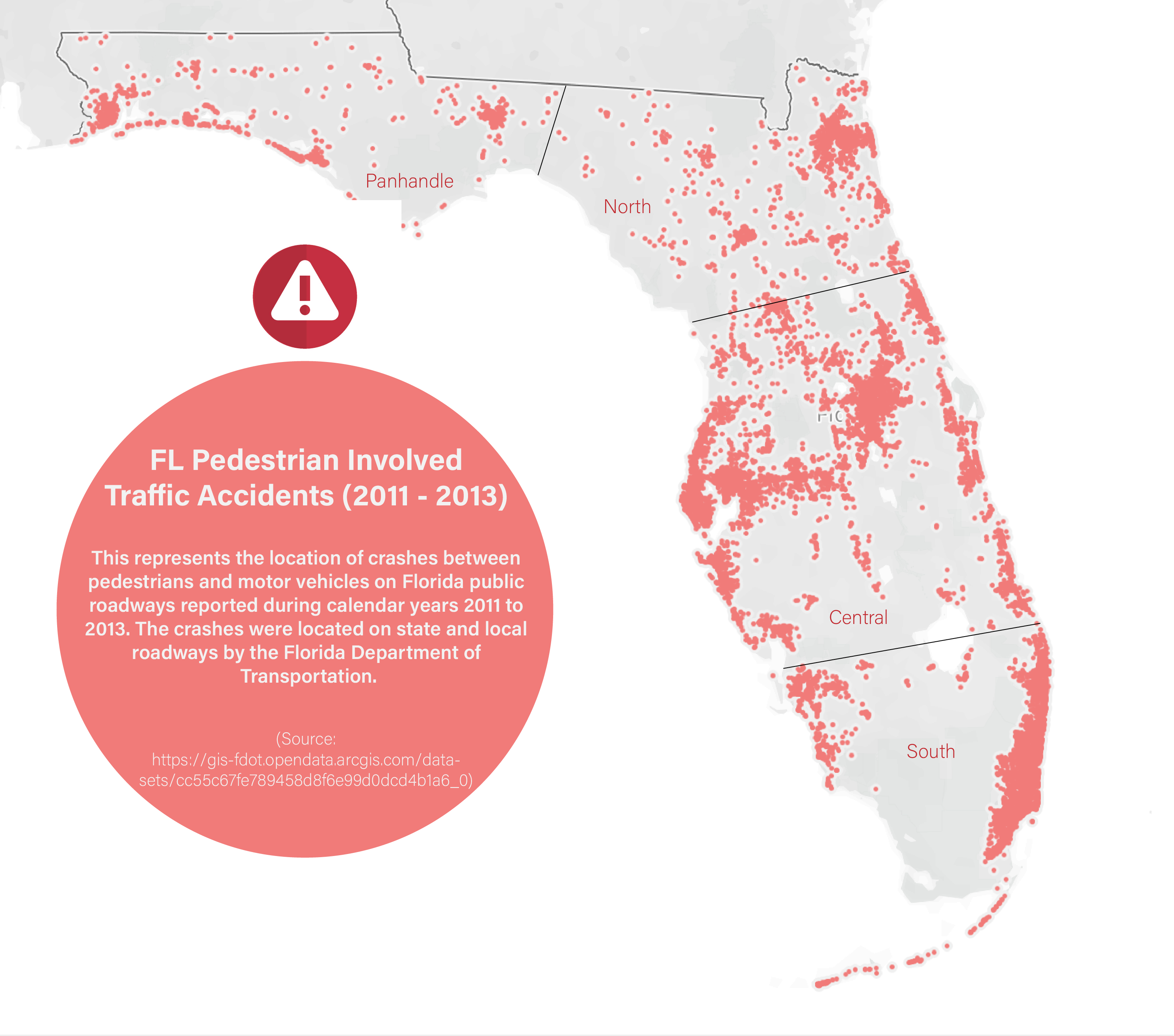
This visual is from the FL Department of Transportation data set on
pedestrian involved traffic incidents from 2011 to 2013.
I added delineation between the four subsections of Florida (Panhandle, North, Central, South) with rough, estimated lines. One way that this could have been more accurate is to
use another geographic layer with the predefined, official delineation lines. However, for the purposes of this infographic, the rough estimates provide enough clarity between
the different sections of cities and regions. I found it difficult to add any additional images of clip art for two reasons:
- The images of car accident clip art were noisy and did not add to the interpretation of the graphic
- The topic of pedestrian involved accidents is serious and should be represented with sensitivity for those involved