This module's assignment called to create my own visualization based on correlation or regression analysis using ggplot2. The visual should follow our textbook's recommendation of using grid to enhance the comparisons between scatter plots or your variables.
To the best of my ability, I experimented with different packages and correlation visualizations. Below you will find my thoughts on each of them. The most significant thing I find lacking in the visualizations is a linear regression model (with the exception of the marginal plots). I found it difficult to add the regression lines on the correlogram's multiple panes.
corrgram() of mtcars
The ellipses on the bottom left provide a view that is easier to interpret than the scatterplots, however, the number of variables makes the visualization overall noisy. To account for this, the next plot views just a subset of the mtcars data.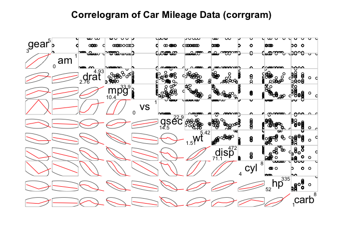
corrgram() of mtcars Subset
Here, the focus on only a select number of variables creates a more effective visualization in my opinion. There is not nearly as much information as the first plot, however, it is even easier to clearly see the relationship between the 3 variables presented.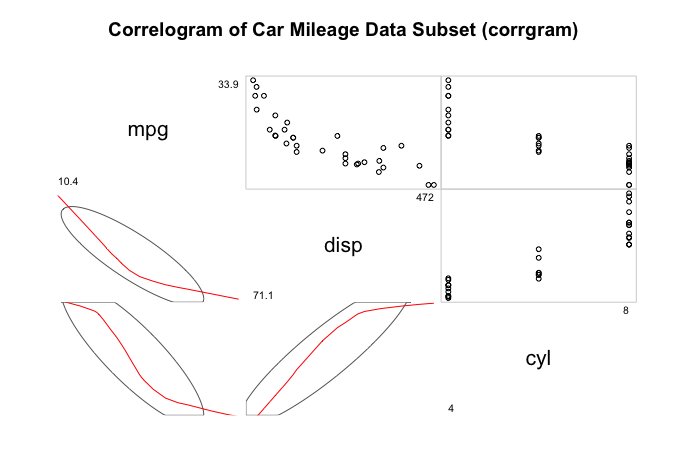
qplot() Heatmap of mtcars
The color scale of the heatmap makes it easier to interpret than the corrgram() above in my opinion. With such a large number of variables, the scale of a color is allows for a quicker understanding than interpreting the orientation of lines or points.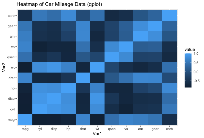
ggcorrplot() of mtcars (Upper)
This ggcorrplot() provides an even better color scale, that allows the viewer to more clearly see whether variables are postiviely or negatively correlated.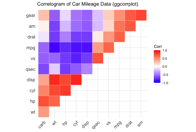
ggcorrplot() of mtcars (Circle)
The circles on this plot make it aesthetically appealing, however, there is a great deal of noise especially with the diagonal collection of circles with the same values that can lead to confusion without further explanation of how to read the visualization.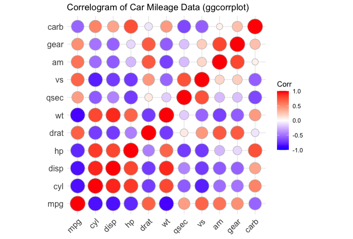
ggcorrplot() of mtcars (Lower)
This ggcorrplot() stood out to me because it includes labels with the actual correlation value of the variables.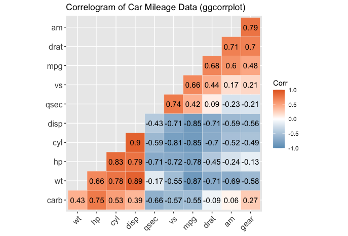
ggcorr() of mtcars (GGally)
This provides a similar view as the previous plot with a different color theme due to the differences in packages (ggcorrplot vs. GGally). The orientation of the labels may be confusing to readers without an understanding of correlograms.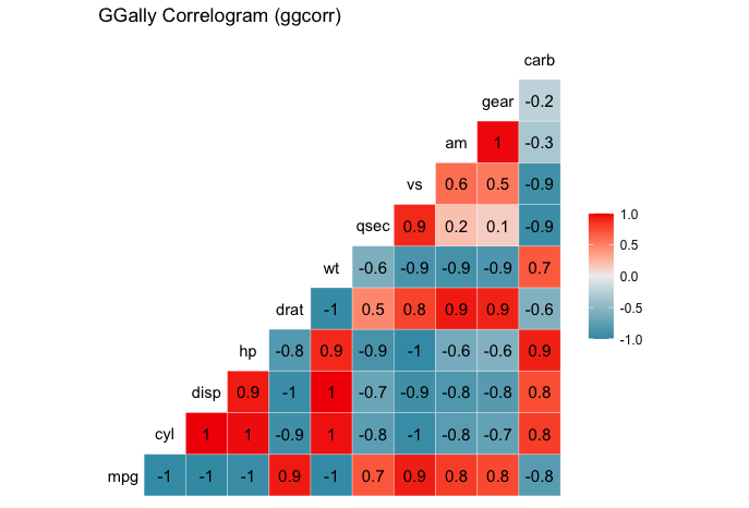
ggpairs() of mtcars (GGally)
This plot utilizes an extension of ggplots (GGally), that allows the viewer to see the correlation coefficient in the upper triangle and distributions on the diagonal. While interesting and aesthetically pleasing, the number of variables makes it difficult to interpret.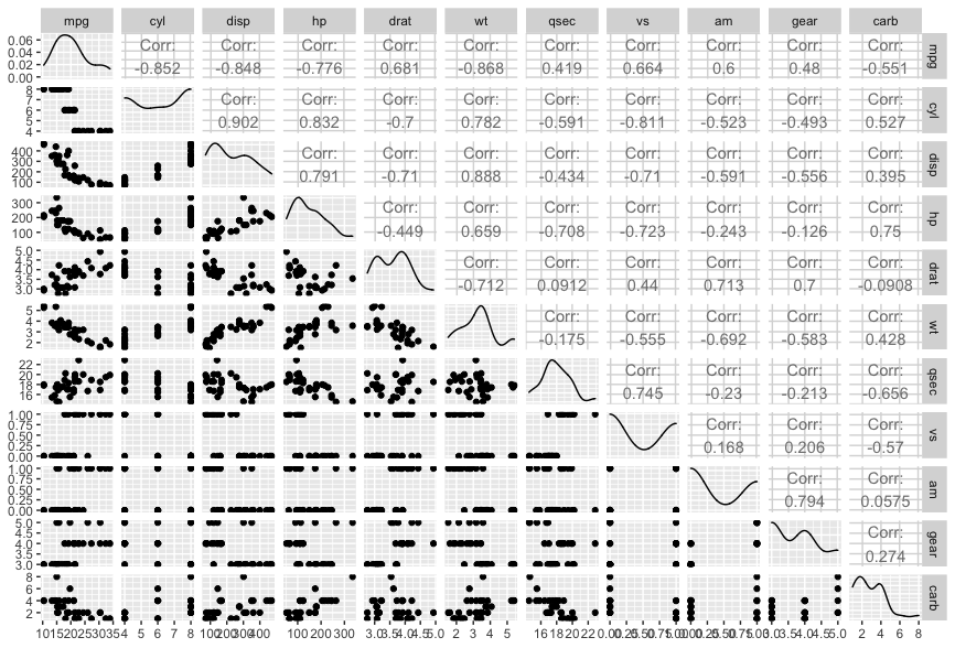
ggpairs() of mtcars Subset (GGally)
I consider this an improvement on the previous plot because differences are easier to interpet in the absence of a large number of variables.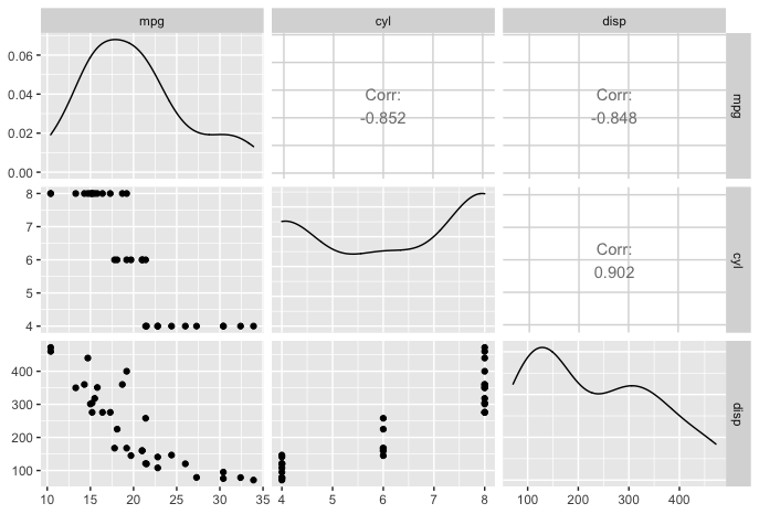
ggMarginal() of mtcars (ggExtra histogram)
This GGally plot focuses on only 2 variables, but provides an in-depth look at the relationship between them. The addition of the histograms on the axis are insightfuly, but could use additional labelling.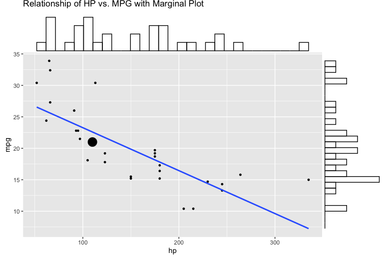
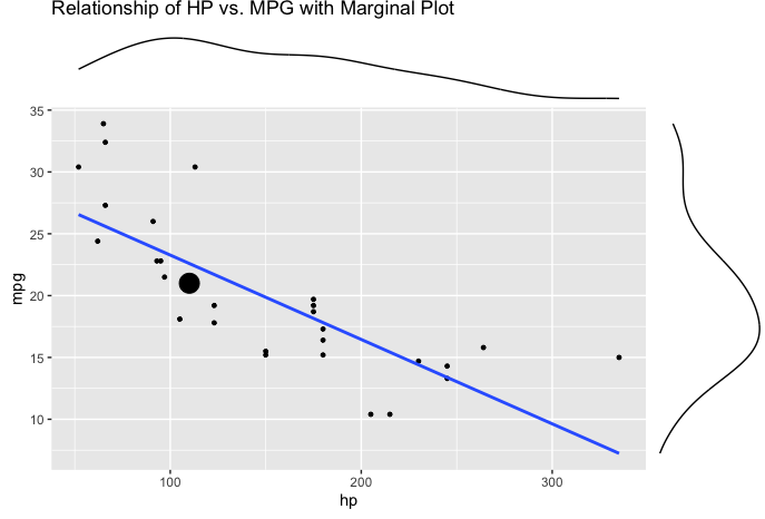
ggMarginal() of mtcars (ggExtra density)